Angry_Tiger_1
New member
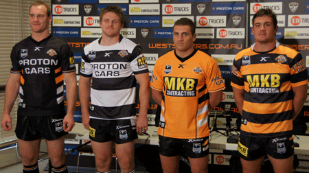
The whole main playing kit looks really sharp this year. No need to ever change it.
Follow along with the video below to see how to install our site as a web app on your home screen.
Note: This feature may not be available in some browsers.
@innsaneink said:Yep, agreed…looks awesome.

@Cultured Bogan said:I'd like that to be our main, and the tri colour hoop that we wore against Manly last year to be our alternative.
They are simple, easy on the eye and could well be those strips where people look at them and instantly identify it with our club, ala red V with St. Merge and the cardinal & myrtle of Souths.
@glebe_tiger said:anything will be better than the grey ones.
@Demps said:I'm a fan…
Stated a few times on here before, 2010 ones were my favs....
@Russell said:Absolutely hate it with a passion.
Predominately orange for me - no one else has that.
Just to break the myth - I don't think anyone ever - in the history of the world has seen a black tiger.
@Russell said:Just to break the myth - I don't think anyone ever - in the history of the world has seen a black tiger.
@Demps said:I'm a fan…
Stated a few times on here before, 2010 ones were my favs....
