All credit due to Peter V'landys for stubbornly pushing through the worst of COVID restrictions to stage a ompetition and financially save the league!
But this clumsy effort by he & his stooge Abdo to make unauthorised demands of the NSWRL and Origin team to change the jersey colour in Adelaide back to pale blue - JUST TO placate their idiot media stakeholders who are wired for creating controversy from nothing (and whipping up hysteria among the social media pond dwellers) waS embarassing!!
They don't even seem to have a basic understanding of the logistical prodution/supply chains required for player tailored jerseys to be re-produced in 3 days!! F-wits!!
The NSWRL were always going to give them the middle finger - and put them back in their box!! Upstart clowns!
 www.smh.com.au

The Daily Telegraph - in particular Fatima Kdouh should just stop covering rugby league!)
But this clumsy effort by he & his stooge Abdo to make unauthorised demands of the NSWRL and Origin team to change the jersey colour in Adelaide back to pale blue - JUST TO placate their idiot media stakeholders who are wired for creating controversy from nothing (and whipping up hysteria among the social media pond dwellers) waS embarassing!!
They don't even seem to have a basic understanding of the logistical prodution/supply chains required for player tailored jerseys to be re-produced in 3 days!! F-wits!!
The NSWRL were always going to give them the middle finger - and put them back in their box!! Upstart clowns!
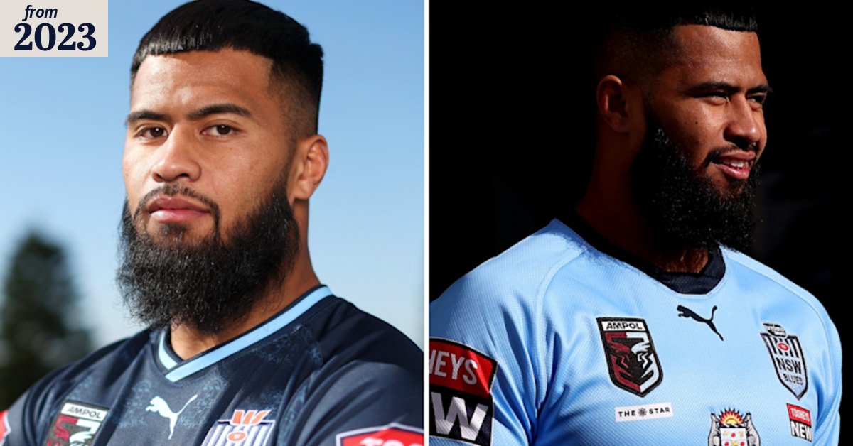
‘Not a new idea’: NSW to refuse NRL request to ditch navy Origin jersey
Head office’s request for the NSWRL to revert to its traditional sky blue Origin jersey in Wednesday’s series opener is set to fall on deaf ears.
The Daily Telegraph - in particular Fatima Kdouh should just stop covering rugby league!)
