Fade_To_Black
New member
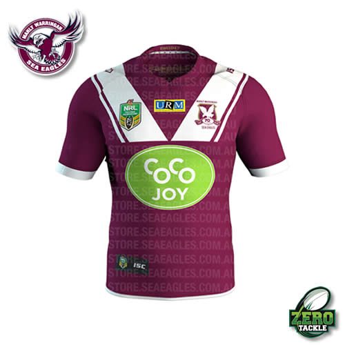
Notice how they are still flogging the 'Unite Commit Achieve' policy line on the inside back of the Indigenous one…..talk about flogging a dead horse. The fact that it is hidden on the inside of the jersey speaks volumes.
Follow along with the video below to see how to install our site as a web app on your home screen.
Note: This feature may not be available in some browsers.
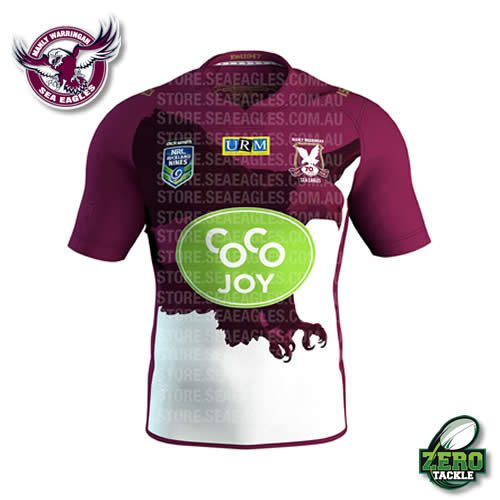
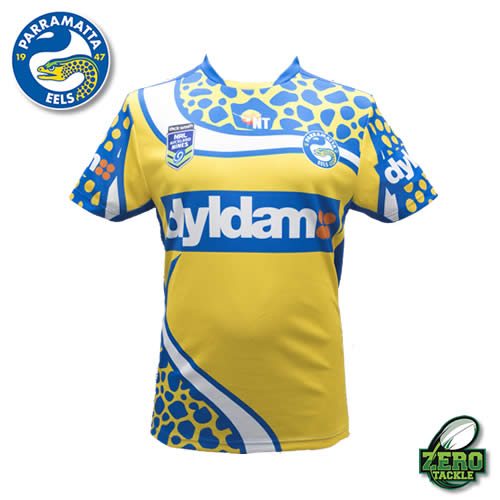
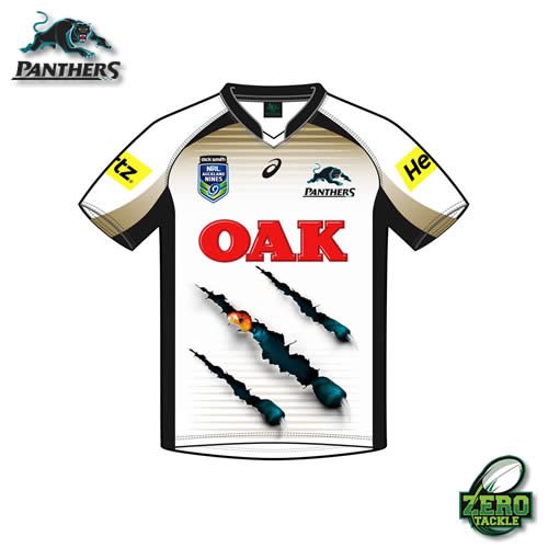
@Sabre said:I get the feeling that clubs are starting to target their Nines jerseys at children
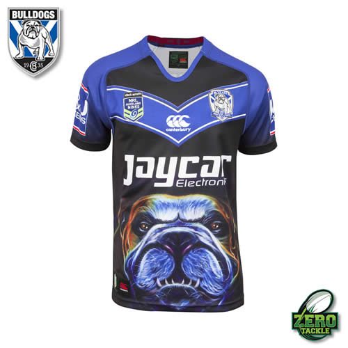
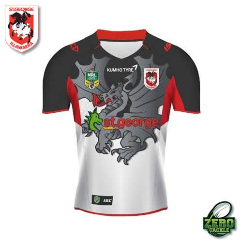
@Sabre said:It's just a shame the Brydens logo is so big and ugly.
@innsaneink said:@Sabre said:It's just a shame the Brydens logo is so big and ugly.
Yeah I know…its ugly...but at least the colours match...imaging if their logo was red and green, or blue & yellow
@Sabre said:@innsaneink said:@Sabre said:It's just a shame the Brydens logo is so big and ugly.
Yeah I know…its ugly...but at least the colours match...imaging if their logo was red and green, or blue & yellow
Yeah manly's is horrible for that reason