Kaito
Well-known member
JD Sports, BYD or even Meriton would have been so
much more visually appealing. Oh well, only 3 years.
much more visually appealing. Oh well, only 3 years.
Follow along with the video below to see how to install our site as a web app on your home screen.
Note: This feature may not be available in some browsers.
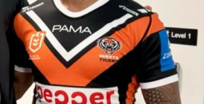
From someone in the industry, words cannot describe how amateurish and horrid that looks.It’s not too hard … you put a double thick white outline around it… actually one of our colours.
Yeah missed the mark here.Logo looks horrible especially on the orange jumper.
We were spoilt with the Brydens colourway, a lot
of people on here hated it, hate to say I told you so.
That white box, red writing & green is an eyesore lol
Yeah missed the mark here.
It's easy to make the background clear essentially and just have the text.
Really cheap looking on a very tidy jersey.
The jersey is so nice man and that white box really takes away from it.My thoughts exactly captain, hopefully we can work
with them to streamline the logo. Red Harvey Norman
sleeve sponsor should have been on the the black
jersey, and blue Zurich on the orange jersey too smh
Looks busyHmm not a fan.
Top half is pretty much the same design but somehow worse looking.. Bottom half is 05. Looks like 2 different designs mushed together.
Yeah I get that, but wouldn't both the club and the sponsor want the jersey to look appealing to fans??? I mean I googled pepper money and they have a white varient of there logo, take away the white background and bung this on the front of the jersey, even with a little splash of green on the pepper, and it would be so much more appealing...Companies spend big bucks to sponsor and their logo is red, it’s their brand why would they compromise their brand to appease a few.
As for the white box, red is a colour that doesn't mix well with others, outside of white and few light shades it bleeds with most colours and is almost illegible on most backgrounds.
Lucky Api is wearing his shorts…From someone in the industry, words cannot describe how amateurish and horrid that looks.
Like a $3.28 wish.com negligee next to a Victoria's Secret soft silk and lace work of art.
The Harvey Norman is for the NRLW, it will be on both the orange and black jerseys for the NRLW.Or at least kept one. Why different sleeve sponsors
for both jerseys. Anyway, was just expecting more
Why?Companies spend big bucks to sponsor and their logo is red, it’s their brand why would they compromise their brand to appease a few.
As for the white box, red is a colour that doesn't mix well with others, outside of white and few light shades it bleeds with most colours and is almost illegible on most backgrounds.

It looks like a pinned on number at a kids athletic carnival.From someone in the industry, words cannot describe how amateurish and horrid that looks.
Like a $3.28 wish.com negligee next to a Victoria's Secret soft silk and lace work of art.
They've paid multiple times more than Brydens from what I can gather. I have a feeling Lee took Liberty's and put his company's logo on our jersey for less than market rateI think Pepper money is the sponsor you get when you’ve won 3 spoons, surprised they out paid Brydens.
Hopefully in 3 years bigger mobs are lining up.