simonthetiger
New member
x2
Follow along with the video below to see how to install our site as a web app on your home screen.
Note: This feature may not be available in some browsers.
@galahs said:I took GAZF's design and made one "V" white and one arm band white.
I think it looks grouse!
[](http://s90.photobucket.com/user/galahs/media/wests/2014_wt_gazf_mod1_zpsf71b6e3d.jpg.html)
@Kul said:i bet the "fans" vote in something like this:

it will be designed by Deserie from Whoop Whoop, a 37 year old mother or two, a Wests Tigers Member who has a fantastic story to tell for the front page of the official site.
"It represents the new direction Wests Tigers are heading and encompasses our fan's wishes for a state-of-the-art jersey design that pleases the eye" said WT CEO Stephen Humphreys.
The jersey will go on sale for $249.95 and be available in L, XL and XXXXXXXXXL
@galahs said:I took GAZF's design and made one "V" white and one arm band white.
I think it looks grouse!
[](http://s90.photobucket.com/user/galahs/media/wests/2014_wt_gazf_mod1_zpsf71b6e3d.jpg.html)
@galahs said:I took GAZF's design and made one "V" white and one arm band white.
I think it looks grouse!
[http://i90.photobucket.com/albums/k248/galahs/wests/2014_wt_gazf_mod1_zpsf71b6e3d.jpg](http://s90.photobucket.com/user/galahs/media/wests/2014_wt_gazf_mod1_zpsf71b6e3d.jpg.html)[/QUOTE]
That's a great design mate! Where can I get one :slight_smile:
_Posted using RoarFEED 2013_
@galahs said:I took GAZF's design and made one "V" white and one arm band white.
I think it looks grouse!
[](http://s90.photobucket.com/user/galahs/media/wests/2014_wt_gazf_mod1_zpsf71b6e3d.jpg.html)
@galahs said:Now if we could just get GAZF to do a reverse design switching the black and gold around we have a ready made main and alternate strip.
@galahs said:I took GAZF's design and made one "V" white and one arm band white.
I think it looks grouse!
[](http://s90.photobucket.com/user/galahs/media/wests/2014_wt_gazf_mod1_zpsf71b6e3d.jpg.html)
@galahs said:I took GAZF's design and made one "V" white and one arm band white.
I think it looks grouse!
[](http://s90.photobucket.com/user/galahs/media/wests/2014_wt_gazf_mod1_zpsf71b6e3d.jpg.html)
@Cultured Bogan said:@galahs said:I took GAZF's design and made one "V" white and one arm band white.
I think it looks grouse!
[](http://s90.photobucket.com/user/galahs/media/wests/2014_wt_gazf_mod1_zpsf71b6e3d.jpg.html)
Love it Galahs. A simple and effective design.
It's what can become an iconic design, much like the double V designs that made Wests and Balmain easily identifiable. St. George and Souths have had pretty much the same designs for ages and still sell jerseys.
Pretty boring design. Doesn't do anything to help further wests tigers as a separate identity. It feels dated and doesn't reflect the youthfulness in the WT brand. Further, our club is know for being exciting, both on the field and off, which is why (it appears) we attract so many of the younger generation. A jersey needs to be cool and exciting, not something that harks back to a another generation which is meaningless to most, but is held onto but a few.
I think this design really nails it on the head. It even reflects the style of the logo. It's got a perfect, contrasting, unique orange that is not balmain gold, has it's far share of black with a highlight colour of white. Perfect sponsor placement. Youthful and modern.

Cheers
If I had to chose a fan, these are very good:
@Craegus said:Here are my three designs as submitted to the Tigers:
[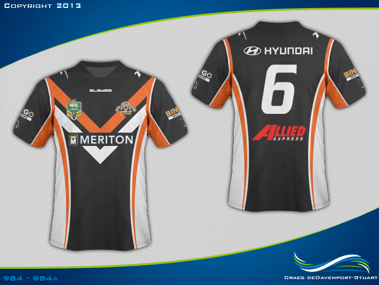](http://s47.photobucket.com/user/craegus/media/WestsTigers2014Concept1n_zpsef994109.png.html)
[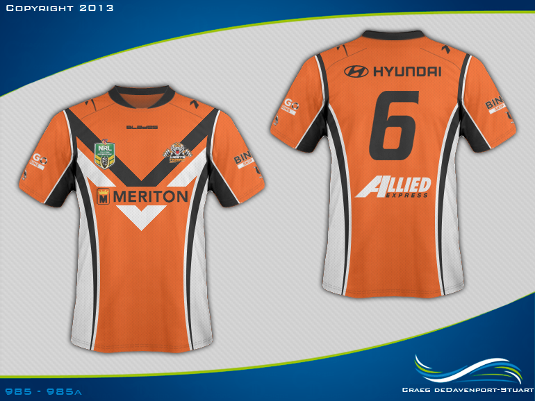](http://s47.photobucket.com/user/craegus/media/WestsTigers2014Concept2n_zps6a864003.png.html)
[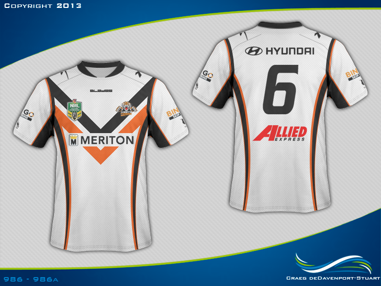](http://s47.photobucket.com/user/craegus/media/WestsTigers2014Concept3n_zps88050970.png.html)