The designs are aimed at kids / early 20s , late teens I’m almost sure of it .I was always concerned when it was first rumoured CCC were coming on board
Their street gear is good but there union stuff ive never liked...so far our gear weve seen is nothing like their union stuff but very far removed from what weve had
Training tees a.pass
Hat/cap meh
Polo fail
The playing shorts on the photo of Makasini look like OzTag short
The.jerseys need to be exceptional otherwise its a fail for me, and Steedens designs have been better
Do.we still have that community welfare thing the three tiger cubs logo represents? I guess if we do some.of the gear will have that on it again
And let’s face it , we all had shit taste when we were younger . Ed Hardy anyone ? Affliction ? . They were huge 16 years ago . And some of the ugliest shirts I’d ever seen . Especially for 200 plus dollars .
The minimal style of 2010s , which is I’m guessing everyone is most into , I’m not sure that’s what younger people are into . I’d say they’d be close to wanting an Ed hardy shirt than a plain T from industrie. Which I think goes a long way to informing the style choices the team makes .
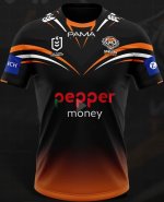
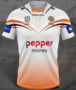
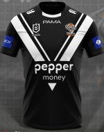
That Polo shirt is almost like they designed the shirts then stuck the sponsorship on it , not integrated it like you would think .