426Tlgerland
Well-known member
I’m good with these , they are quite good , the white one is the fav but happy to own any of them , well done to the club and CCC
Time to jump on line and grab me one
Time to jump on line and grab me one
Follow along with the video below to see how to install our site as a web app on your home screen.
Note: This feature may not be available in some browsers.
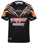
I can live with the small blue Zurich box. It’s not front and centre and anything is an improvement on that hideous white box that was right on the front of the jersey.Hate to be the lone voice of complaint.
First it was the hideous oversized Brydens logo, then it was the white box, now they've almost nailed it, but God that Zurich blue box on the sleeves has ruined what was almost perfection.
Sorry guys. 😢
I would have liked one in black but i will purchase an orange oneI like them. Don't love them. I like the fact we have a white jersey more than I like the jersey itself. Prefer the look of the orange personally.
you are indeed very correct thank you Chat GPT alsoA black jersey in the same design would look incred
Great work @KCtigeryou are indeed very correct thank you Chat GPT also
That's one of the ugliest designs I have ever seen too wishy washy
It's perfectyou are indeed very correct thank you Chat GPT also
As soon as I tried to change things ChatGPT started ruining it so that was the best one I could get sorryGreat work @KCtiger
I wonder if we could make the Tiger Strips a fraction larger/more prominent
Black does look great
Wouldn’t be surprised at all if this popped up as a Captains run jersey either tbhyou are indeed very correct thank you Chat GPT also
That’s what they should have rolled out. That looks awesome.you are indeed very correct thank you Chat GPT also
Thats what I was thinking......did the same this year with the black player only captains run traing jumper ....only to release it laterWouldn’t be surprised at all if this popped up as a Captains run jersey either tbh
Like I have said before, this corporate logo of theirs would have been a much more tasteful alternative to adorn the sleeves. The royal blue colour and shape are a vast improvement over what is currently being used.I can live with the small blue Zurich box. It’s not front and centre and anything is an improvement on that hideous white box that was right on the front of the jersey.

Champion @Tiger_claws - great to hear first hand.Couldn’t help myself and ventured off to the Roar store this morning. Got myself an away jersey & the young fella the home jersey. They told me sales are through the roof. I will be getting more as the gear looks great in person.
Even without the fading from the bottom, that would have been a great looking jersey to release.... I don't mind the idea of bringing out 3 jerseys, each one to represent each colour...you are indeed very correct thank you Chat GPT also
Got a link?Just seen the video of Romey before the launch yesterday & the hoodie Benji has on is going to cost me another nice dinner for the wife. Geez she will start to think I like her.
I only weigh about 5kgs more than my playing days 25 years ago...So do I, that's why I'll be getting the orange one 😉


No sorry. I was flicking through X and seen it. I will try & find it.Got a link?