Jersey Talk

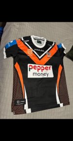
Thought I'd give the new design a little tweak to see how we could integrate the sponsor logos better (and to tweak the design slightly to fix the part of the design that should not have been allowed to pass through the approval stage. See if you can work out what part). Of course template is slightly different so not an exact recreation, but close enough (plus a better manufacturer as an added bonus).

Not perfect, but better than the boxes.

And an added second alternate as well to allow the sponsors their full coloured logos.

KJgBamA.png
Not the middle one, red on black rarely works, the red will bleed into the black particularly on TV or in average to poor lighting.
 
Not the middle one, red on black rarely works, the red will bleed into the black particularly on TV or in average to poor lighting.
This is probably the real reason for the white backgrounds on the sponsors logo . Pretty hard to argue against if the sponsor doesn’t get his logo easy to read on the tv .

Yeah that is why I said they were not perfect. Was more of a test in if it was possible. The ideal as we all know would be the sponsor being in white on the black.
 
Thought I'd give the new design a little tweak to see how we could integrate the sponsor logos better (and to tweak the design slightly to fix the part of the design that should not have been allowed to pass through the approval stage. See if you can work out what part). Of course template is slightly different so not an exact recreation, but close enough (plus a better manufacturer as an added bonus).

Not perfect, but better than the boxes.

And an added second alternate as well to allow the sponsors their full coloured logos.

KJgBamA.png
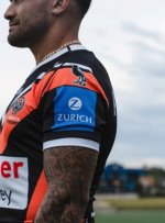
You changed the collar... And sleeve sponsors blue box
 
Yeah that is why I said they were not perfect. Was more of a test in if it was possible. The ideal as we all know would be the sponsor being in white on the black.
Yea it didn’t even occur to me that that’s probably why the background is white . Now it makes total sense , especially on a night fixture , or when t the jerseys get dirty .
 
Sleeve sponsors?

Nope. Sponsor changes were to make them look "better".

This was part of the actual jersey design. It is subtle, but when I noticed it on the actual jersey I couldn't unsee it. It was something that the design team should not have gotten away with due to what a stupid thing it is, and what would have taken no time to fix with no-one probably even noticing the difference in the design element.

Though I will say it is not on the fan design (having just looked at my one), so may have been fixed, though I bet for the player version it will still exist.
spit it out man/woman/child
 
Last edited:
spit it out man/woman/child

😂😂😂

Fine.

The larger V on mine is ever so slightly wider as to not have the text of the club logo spill out onto the main body of the jersey. Have a look at the players in the new jerseys and you will notice that they had to put a small stroke around the last letters in the word Tigers as they didn't sit on the contrasting colour of the V, so there was black text on the black body of the jersey, and orange on the orange. Small detail most won't notice or care about, but poor design work.
You must be well respected in the textile/your indusrty ? I know this years design has been a bugbear .As another thread stated last night, perfection goes unnoticed ,
 
You must be well respected in the textile/your indusrty ? I know this years design has been a bugbear .As another thread stated last night, perfection goes unnoticed ,

Nope, nothing to do with those industries. Just have been doing designs for fun, and reading/watching criticisms of designs for long enough to be able to notice these little things that are lazy design decisions.
 
Nope, nothing to do with those industries. Just have been doing designs for fun, and reading/watching criticisms of designs for long enough to be able to notice these little things that are lazy design decisions.
pop a few up of your favorite WT ,1 for every other team if you have them plz
 
please show us 3 of your favourite WestTigers jerseys you have designed and 1 one from every other club if you dabble in designing other teams jerseys thank you thank you ta ta

Well that will take a while to go back and find them all. Luckily I have these;

This is the last NRL portfolio I did on a different forum;

The NRL Dynasty

And the one before that;

The NRL by ISC

Hopefully that will suffice for now.
 
😂😂😂

Fine.

The larger V on mine is ever so slightly wider as to not have the text of the club logo spill out onto the main body of the jersey. Have a look at the players in the new jerseys and you will notice that they had to put a small stroke around the last letters in the word Tigers as they didn't sit on the contrasting colour of the V, so there was black text on the black body of the jersey, and orange on the orange. Small detail most won't notice or care about, but poor design work.
I actually did notice that when they were first released.... Last night I was comparing your designs to one someone's selling on FB.

Screenshot_20250119_075013_Facebook.jpg
 
I actually did notice that when they were first released.... Last night I was comparing your designs to one someone's selling on FB.

View attachment 19493

Ah ok, yeah the retails seem to be fine. Just the player ones with the issue.


And yep, that is it. Poor execution in the design, even if it is just because of jersey sizing, that really should be taken into consideration. The fact that they just added the stroke around the letter shows laziness over anything.
 
Back
Top