OAK worked well as its a short three letter word with the text able to be very thick
Navigation
Install the app
How to install the app on iOS
Follow along with the video below to see how to install our site as a web app on your home screen.
Note: This feature may not be available in some browsers.
More options
Style variation
You are using an out of date browser. It may not display this or other websites correctly.
You should upgrade or use an alternative browser.
You should upgrade or use an alternative browser.
Jersey Talk - Mega Thread
- Thread starter Demps
- Start date
cochise
Well-known member
I work with a lot of major brands using their logos. Some allow us to make the modifications needed to make a design.work, others are that rigid that we can't create a design.Yes the companies that produce the jerseys also design them. But they are liasing with the club the whole time and have to have the design signed off by the club before moving forward. But as with the below bit sometimes there isn't an option, though a lot of the time there are solutions that are just ignored, or the clubs don't think about. Such as the white box being a design element that could connect to the side sections and be integrated over just being plastered on.
This is 100% the case, I don't have any insider info, but it is the sponsors paying for the logo to appear so they do get a major say in how their logos appear, usually to the detriment of designs. And having been a club that may not be the one that sponsors want to be seen on makes them have even more power as they can just walk away and find someone else. As such we are at their mercy. But hopefully over time the relationship improves and they are more willing to adapt to make the designs look better.
The white outline worked with Penrith and Oak, and was legible, it may not be perfect, but even on the current background it won't be easy to see the sponsor on tv or from a distance with movement, it is the standing around or still shots where it will be easy to see, for those wanting to find out what it is. However in the postition we are in right now, we won't know what could be and have to live with what is.
cochise
Well-known member
The sponsor signed on in December, the design would have been approved months before so is probably another reason they went with the white box.It would work fine… the original is just a bad design.
We already have white in our colours… they could have designed it keeping the white background (if a prerequisite) in a way that it better incorporated into the jersey.

I work with a lot of major brands using their logos. Some allow us to make the modifications needed to make a design.work, others are that rigid that we can't create a design.
Oh I can only imagine how bad it must be with some companies. Especially if you have them thinking that anything can be done with their logo as they think it is perfect as it is, when anyone with a design eye is looking and going there is no chance that will work at all. And it would be worse with the more powerful companies as well.
You’re most probably right Cochise but (without knowing if it’s a big no no on their style guide) I think it would have looked much better with the white key lined version Craegus did … although I would have had a marginally thicker key.The sponsor signed on in December, the design would have been approved months before so is probably another reason they went with the white box.
As ANZ are major shareholders in pepper I’m sure they would have a style guide as thick as a dictionary.
PS Would have been nice to nab ANZ as sponsors (pun intended).
hank37w
Well-known member
Do we even know if Pepper Money were even shown anything other than that hideous white box version?
cochise
Well-known member
We work in ice so can't always accommodate what you can do in other mediums.Oh I can only imagine how bad it must be with some companies. Especially if you have them thinking that anything can be done with their logo as they think it is perfect as it is, when anyone with a design eye is looking and going there is no chance that will work at all. And it would be worse with the more powerful companies as well.
Ice =?????We work in ice so can't always accommodate what you can do in other mediums.
cochise
Well-known member
Yeah I run an ice company, we do everything from bagged ice right up to ice sculptures.Ice =?????
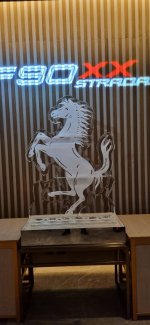
This is one i did at the Melbourne GP last year for Ferrari.
Second picture is at the end of the night but shows how much the ice clears up after it has been set up for 20 minutes or so.
Attachments

Oh, quite literally ICE. WowYeah I run an ice company, we do everything from bagged ice right up to ice sculptures.
This is one i did at the Melbourne GP last year for Ferrari.
Second picture is at the end of the night but shows how much the ice clears up after it has been set up for 20 minutes or so.
I thought it was an acronym of sorts like Internal Combustion Engine
cochise
Well-known member
Yep literally iceOh, quite literally ICE. Wow
I thought it was an acronym of sorts like Internal Combustion Engine
Huh ? ANZ don't own Pepper Money ? Not sure where u got this fromYou’re most probably right Cochise but (without knowing if it’s a big no no on their style guide) I think it would have looked much better with the white key lined version Craegus did … although I would have had a marginally thicker key.
As ANZ are major shareholders in pepper I’m sure they would have a style guide as thick as a dictionary.
PS Would have been nice to nab ANZ as sponsors (pun intended).
 This is still my fave design by someone on this forum.
It’s gangsta
Could even have the whole sponsors write in white on the front so the magpie guys don’t complain there’s not enough white
We would actually look like a prestige team with history like the roosters, dragons, dogs jerseys.
Our tigers Hersey keeps changing with stupid stripes and honey comb stuff - it’s all over the map.
We need one jersey we can use that gives us a strong identity.
My mistake mate it’s majority owned by ANZ Holdco… very similar name😵💫Huh ? ANZ don't own Pepper Money ? Not sure where u got this from
Kaito
Well-known member
This kit goes hard ✔️✔️✔️


Wagga_Tiger
Well-known member
Picked this up today

AmericanHistoryX
Well-known member
Looks cool.
Saw this last night.Picked this up today
View attachment 20624
They look great.
Training T?