They still can't get the orange right

Kul

Administrator
Staff member
Forum Leader
It's been raised so many times before and the club have even acknowledged it, but AGAIN they can't get the damn orange right:
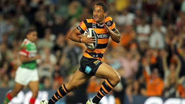
2017 jersey:

![](https://s4.postimg.org/74x1uvi1p/orange.png)

The thread on the emblem is the right colour, surely someone in Quality Control is able to see that they don't match.

It's not as bad as the high-vis blood-orange from 2012, but it's not our proper orange:

![](http://i97.photobucket.com/albums/l201/wests_magpies/archives/2011_marshall_balmainheritage.jpg)

It REALLY irks me and has been a very big factor in me not buying a jersey for the past 5 years
 
Did Wests Tigers officially change the colour from gold to orange in 2000? If yes, that would make our heritage jerseys accurate to the Balmain gold, but not necessarily Wests Tigers orange?

Black and gold, never fold and all that.

Not that I disagree with you, but they do so much nonsense on and off w the jersey that I just buy the ones that catch my eye every few years. I REALLY like the indigenous one from last year, will be going with that for a few years unless I get fat in shorter time.
 
If the orange on the jersey background is the same as the logo…it wont really stand out that much, unless its on a white or black bit
That said Id prefer the orange shade below

Did Wests Tigers officially change the colour from gold to orange in 2000? If yes, that would make our heritage jerseys accurate to the Balmain gold, but not necessarily Wests Tigers orange?

Dont know, what do you think?

![](http://oi67.tinypic.com/sb0uhi.jpg)
 
@innsaneink said:
If the orange on the jersey background is the same as the logo…it wont really stand out that much, unless its on a white or black bit
That said Id prefer the orange shade below

Did Wests Tigers officially change the colour from gold to orange in 2000? If yes, that would make our heritage jerseys accurate to the Balmain gold, but not necessarily Wests Tigers orange?

Dont know, what do you think?

![](http://oi67.tinypic.com/sb0uhi.jpg)

No I don't mean the shade, the RGB, I mean are our colours now officially "black, white and orange"? When it was black and gold, you couldn't venture too far away from the traditional Balmain orange and still call it gold (because let's be honest, it was orange). But if the official colour is now orange, well there is a whole blood-orange / grapefruit / coral / hi-vis pantheon of electric hues they can call on.
 
![](http://i288.photobucket.com/albums/ll165/Hemsley2005/607CE464-AF2E-0345-0106184706B84E932017WestsTigersjersey_HOMEFRONT002_zpsnfd14gnr.jpg)

doesn't look too bad in this photo. then again, i haven't seen the real thing
 
Its described as orange by the club now….
but yeah Balmain were orange too even if it were called gold, gold imo is more yellow than orange.
 
Orange is made up of the primary colours Yellow and Red.
When the Red is too prominent it turns into a horrible colour.
 
I love the orange (and the jersey) that Benji is wearing in Kul's second photo.

Kul, can you show us a picture of a tigers jersey with the orange that you do like?
 
Maybe the fabric has something to do with it. it always looks shiny rather than the old style cotton jerseys. Balmains kit from the 80s was unreal.
 
Orange is one of the hardest colours to do nicely in print, so they might be choosing a certain swatch that they know will also print well on offset without a Pantone.
 
@DonnyBrasco said:
Orange is one of the hardest colours to do nicely in print, so they might be choosing a certain swatch that they know will also print well on offset without a Pantone.

Que?
 
@jirskyr said:
@DonnyBrasco said:
Orange is one of the hardest colours to do nicely in print, so they might be choosing a certain swatch that they know will also print well on offset without a Pantone.

Que?

Orange can be a tricky colour to get right across all mediums, and I'd say the people who make the jerseys most likely have an Inhouse designer who might select the colours to choose from…

http://www.signs101.com/forums/archive/index.php/t-110552.html
 
The Colour across the top ends at the sleaves , making it look like a vest.
Think this is why many preferred Cragegus Design.
 
Back
Top