Follow along with the video below to see how to install our site as a web app on your home screen.
Note: This feature may not be available in some browsers.
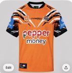
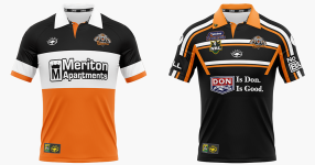
The top is shades of Sydney Tigers!Got these put together just to see if the designs translated to real life.
Not perfect with the sleeve sponsor on the home, though I do somewhat like how it was done, and the side of the away is not exactly how I envisaged it, but still works.
![]()
![]()
I like the white as the away jumper , clean , now the hard part the home jumper , good luck folks as there will be disappointment coming no matter what it isThe top is shades of Sydney Tigers!
The white looks good as an alternate.
This one is again a clean look , I like the bright clean in the orange and the white oneView attachment 43424
Removing the fade improves the home jersey too imo.
like that black orange and white oneGot these put together just to see if the designs translated to real life.
Not perfect with the sleeve sponsor on the home, though I do somewhat like how it was done, and the side of the away is not exactly how I envisaged it, but still works.
![]()
![]()
I wonder if the club would ask he design team to make 3 options for home and away each then put it to members to vote on them , I’m not sure how we satisfy everyone but maybe this is a way forward and hold that jumper for 2 years , or have members like some on hear who are quite good at computer stuff to throw some ideas at them to look at and see what people / supporters are thinking ,
Agree totally. I know my own views are the minority, and opinions are subjective by their very definition.If you have ever seen the online team design competitions it will show how bad it usually will go.
Either claims of teams rigging the competition, the “winning” designer coming across as a plant to make the competition seem legitimate though it likely wasn’t, or just terrible designs being chosen to force what the team wants (even when everyone knows there were better designs out there).
Oh and of course the constant arguing of fans who cannot come to a consensus over what is the right design for the team. Just look on here with the lack of consensus over what we should wear (and where we should wear it).
That is why when I design it is only ever thoughts over a “we have to wear it” call, as I know there will always be people who believe their ideas are more correct over mine (and I am not saying they are wrong) and also why I never send designs to the club (though I have entered the previous design comps that have been done).
And sadly with all the divide that still exist within this club and the fans, I don’t see a 100% consensus coming anytime soon (despite there seemingly being a right answer, well from my perspective anyway) so it will make and design comp or fan suggestion thing unsuccessful.
💯Agree totally. I know my own views are the minority, and opinions are subjective by their very definition.
People's tastes are always going to differ, so it doesn't annoy me if someone prefers black when I prefer orange or white, but I am firmly of the mindset that the club needs to simply end this eternal appeasement of people insistent on representation for either of the foundation clubs on the jersey.
It's so far beyond time to get over it it is embarrassing.
I have an interest in graphic design, and that's why jersey threads get me involved. They have awesome colours to work with, but are always so limited (apart from the 2010-11 style).
I think the white @Craegus jersey is reminiscent of this, and the design direction they should head in. And although I do say it is the unique colour, I really couldn't give a shit that orange isn't as prominent as white.
But as mentioned, it's unlikely the club will be able to go this way until said people with influence over such matters have moved on.
I really wish they could just have contemporary, sleek jerseys that will sell well each year and not be bound by such pedants.