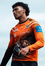
Jersey Talk - Mega Thread

Especially the hideous blue Zurich sleeve sponsorship, at least FAB was a bit more subtle.

I know it will never happen but it is a shame that you can't have the option of buying the jerseys and other merch as a clean skin.
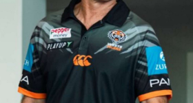
 
This looks like a polo from 2001, the sponsors are also all plastered over the design. It is absolutely trash.
The blue of Zurich stands out, no doubt about it. But it would anywhere on the shirt and obviously has to be on there somewhere. The others arent smacking me in the face when looking at it and don't take much attention away from the polo/design itself in my opinion.
 
I'm surprised the Canterbury logo is orange.
I'm surprised the Canterbury logo is so large and prominent.

Don't recall it being as large or standing out so much on any of their merch that I have seen in the past.

Hope they don't think we are willing to accept shitty looking, over sized in your face logos just because we put up with that crap oversized Bryden's logo for as long as we did.

I'm sure the jerseys will be fine, I'm especially partial to a white jersey and looking forward to seeing what they have to offer.
 
The blue of Zurich stands out, no doubt about it. But it would anywhere on the shirt and obviously has to be on there somewhere. The others arent smacking me in the face when looking at it and don't take much attention away from the polo/design itself in my opinion.
It's more that they are over the design elements, though the design elements are crap anyway.
 
It's a shame that Zurich couldn't use their encircled "Z" corporate logo in the correct coloured blue as it would at least be a great improvement over that ugly blue box they currently use on the sleeve.

Zurich-Logo.jpg
 
What tha?

Surely we’re not designing this gear ourselves, that has to be in house with Canterbury Sportswear.

I bit my tongue over the training jerseys, but this is going from bad to worse.
 

Latest posts

Back
Top