Navigation
Install the app
How to install the app on iOS
Follow along with the video below to see how to install our site as a web app on your home screen.
Note: This feature may not be available in some browsers.
More options
Style variation
You are using an out of date browser. It may not display this or other websites correctly.
You should upgrade or use an alternative browser.
You should upgrade or use an alternative browser.
New Wests Tigers Jersey
- Thread starter Billy M
- Start date

Tucker
Well-known member
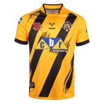
I like the blended V.My mock up.
Very rough however the concept is that there is a blended V that respects the origins of both sides of the joint venture.
This would be our primary jersey.
with a black second jersey and a white alternative for day games.
View attachment 16506
It promotes a sense of strength.

Tiger Stripes
Well-known member
Yuck!My mock up.
Very rough however the concept is that there is a blended V that respects the origins of both sides of the joint venture.
This would be our primary jersey.
with a black second jersey and a white alternative for day games.
View attachment 16506
Tiger Stripes
Well-known member
Not bad.I’ve improved on the previous suggestion;
to create a rotated colour theme of our three colours on each of three background colours.
Let me know what you think?
View attachment 16536
Haha, I agree. Was a bit rough asYuck!
I agree. It’s something we have NEVER done and I cannot understand why. It’s something we can make as signature, just like the Dragons Red V.I like the blended V.
It promotes a sense of strength.
It embraces our ‘One Jungle’ theme and provides a theme to base our designs off that everyone can get behind.
That’s ok, no need to be sorry. Out of curiosity what would you prefer our jersey’s look like or do you like the current ones?I hate them , SORRY
I think it’s also time we move away from the fluro orange. Tigers are more of a rust orange in colour and we should adopt this as our team palate.
For the Balmain fans; there aren’t too many yellow tigers out there other than Richmond’s mascot so I don’t like the idea of going back to the ‘gold’.
With black and white gold provides a weak contrast. The rust orange stands out and is something that can be embraced as a fan colour when wearing their team colours out.
Not a fan of the sleevesI’ve improved on the previous suggestion;
to create a rotated colour theme of our three colours on each of three background colours.
Let me know what you think?
View attachment 16536
Wasn’t sure of that myself. Maybe just the one hoop at the end of the arm to match the color?Not a fan of the sleeves
Subtlety is key for me.Not a fan of the sleeves
i think they're awesome.I’ve improved on the previous suggestion;
to create a rotated colour theme of our three colours on each of three background colours.
Let me know what you think?
View attachment 16536
if you look at the roosters and dragons who still have their traditional "V"s -- i think these look cool. maybe the sleeves could do with some work but i like the Vs.
I dont like the white at all.
Hmm, I don’t get the hate for the white. I personally like the look of a white jersey it’s a nice alternative.i think they're awesome.
if you look at the roosters and dragons who still have their traditional "V"s -- i think these look cool. maybe the sleeves could do with some work but i like the Vs.
I dont like the white at all.
Looks better without the second hoop. Sponsor logos would replace it in any case.Not a fan of the sleeves
We really need a design the team jersey WT competition.
It’s weak. lol.Hmm, I don’t get the hate for the white. I personally like the look of a white jersey it’s a nice alternative.
Compared to strong colors like black and orange - it just looks like a nothing team. Like it could be any team and like a training jersey.
Just my opinion
I didn’t see anything wrong with what we got , the one I really like was the ones we had in 2005 , just my pick .That’s ok, no need to be sorry. Out of curiosity what would you prefer our jersey’s look like or do you like the current ones?
Kelce68
Well-known member
Getting there mate.I’ve improved on the previous suggestion;
to create a rotated colour theme of our three colours on each of three background colours.
Let me know what you think?
View attachment 16536