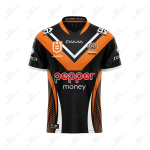
Jersey Talk

You do nice work, Craegus.
I get the feeling you may be in the industry.
And if so, you will be aware of a company's " Style guide".
For those that are unaware, this is a guideline for the display and representation of a company's image and brand. Generally 12-16 pages. Stuff like: what colour the uniforms are. The work vans, etc. But importantly here . . . how a logo is shown on a light background. On a dark background. How much free space above and beside the logo. What proportions the logo can be used at. A version for a plain black logo. The aspect ratio for each font placement. The exact font to be used.
Very serious stuff indeed. These manifesto's are constructed by graphic artists that have a high self value, and might cost a company a lazy 10 large or more.
So while we might say the white box looks horrid, the boffins at Pepper marketing will be concerned how much take up there is in each 0.5 second exposure grab on TV.
Oh, btw, it does look horrid 😉

Can confirm, I am absolutely not in the industry, nor have ever been.

And yes that is very true, however companies can also be very willing to adapt their brand guidlines if the relationship with the partner is strong enough. That can be seen all over with sponsors that go past their style guides to make their logos plain coloured or white to fit better on jerseys. Sure the tigers are not there, and Pepper may not be willing to do it, but it is possible to get as much exposure while making some concessions.

I will also add that I did try and find Pepper Money's style guide to see what it actually said, but couldn't find it.
 
An image of Jarome in the jersey seems to have the logo positioning corrected, also I feel the sponsor logo is featured on a white background to give an even distribution of our colours throughout the jersey.
What I don’t get is in the recent media shots (channel 9 promos) the jerseys all look to be loose on the players. Surely we aren’t going into the season with player jerseys as an easier target to grab hold of for the defence
I'd say they just grabbed a couple for the whole team for the pics. On game day they will be fitted properly
 
An image of Jarome in the jersey seems to have the logo positioning corrected, also I feel the sponsor logo is featured on a white background to give an even distribution of our colours throughout the jersey.
What I don’t get is in the recent media shots (channel 9 promos) the jerseys all look to be loose on the players. Surely we aren’t going into the season with player jerseys as an easier target to grab hold of for the defence

The image with Luai has him in a replica jersey as the logos are embroidered not printed. Quite possibly the same for the media shots as well.
 
Thought I'd give the new design a little tweak to see how we could integrate the sponsor logos better (and to tweak the design slightly to fix the part of the design that should not have been allowed to pass through the approval stage. See if you can work out what part). Of course template is slightly different so not an exact recreation, but close enough (plus a better manufacturer as an added bonus).

Not perfect, but better than the boxes.

And an added second alternate as well to allow the sponsors their full coloured logos.

KJgBamA.png
I love these!

The white box with the sponsors name on our jerseys is hideous. I can’t believe someone thought this was a good look. Every other team has their sponsor’s name blended within the colour of the jersey and Brydens always blended well also, but this new one is just plain ugly.
 
The white box is amateur. They should accept less cash from sponsors to integrate it. Sponsors also shouldn't want to look like a dodgy bargain basement brand. You should have a bit of pride in your jersey and colours. Yes space is sold off to sponsors but producing ugly incoherent jerseys only cheapens the value of it over time. Have some pride and respect tigers!
 
The white box is amateur. They should accept less cash from sponsors to integrate it. Sponsors also shouldn't want to look like a dodgy bargain basement brand. You should have a bit of pride in your jersey and colours. Yes space is sold off to sponsors but producing ugly incoherent jerseys only cheapens the value of it over time. Have some pride and respect tigers!
Craigus was correct in putting a white key line around the name. It’s so obvious, and looks so much better,. Can’t believe this isn’t what we did.
 
Do Steeden do the design work as well as manufacture the jersey?

If so, they need to be gone.

I thought I was being a bit petty over this and the way the Brydens logo overwhelmed our jerseys in the past, but it looks like I'm not alone when it comes to absolute disappointment and disgust in what is being dished up.

Craegus, you are a person that is not even in the industry and you make all these clowns look like complete amateurs.
I would think the white box is a requirement from the sponsor.
 
I'd say they just grabbed a couple for the whole team for the pics. On game day they will be fitted properly
Did you ever hear Blocker telling the story of what happened before the 1989 Grand Final with the Balmain jerseys? The club, maybe NSWRL, had new jerseys made up for the day with the Winfield Cup logo etc on them but when the players got into the dressing sheds and started to put them on all of the jerseys had those 3/4 length mid-forearm style sleeves on them. Trainers had to go around with scissors cutting them down to short sleeves. Bad oversight.
A bad omen for what became a bloody nightmare of an afternoon......still shattered.
 
I hope that next year they fix it up to look like Craegus' version. I am gonna get one this year but if they fix it up, then I will get the updated one and offload the current one to the old man.
The changing of that white box takes it from a good jersey to a brilliant one IMO.
 
I think that’s the point most are making, they could of negotiated a look that is of mutual benefit to both parties.
Some of these companies have very strict guidelines around the use of their logos. It can be very difficult to get them to adapt and we are 3 time spooners.
 
I would think the white box is a requirement from the sponsor.
Agreed, even with the white outline the red would still bleed heavily into the black, the outline would need to be very thick to work.

It works on a still photo but moving on a TV screen or from a distance the Pepper would be almost illegible.
 
Do Steeden do the design work as well as manufacture the jersey?

If so, they need to be gone.

I thought I was being a bit petty over this and the way the Brydens logo overwhelmed our jerseys in the past, but it looks like I'm not alone when it comes to absolute disappointment and disgust in what is being dished up.

Craegus, you are a person that is not even in the industry and you make all these clowns look like complete amateurs.

Yes the companies that produce the jerseys also design them. But they are liasing with the club the whole time and have to have the design signed off by the club before moving forward. But as with the below bit sometimes there isn't an option, though a lot of the time there are solutions that are just ignored, or the clubs don't think about. Such as the white box being a design element that could connect to the side sections and be integrated over just being plastered on.

Some of these companies have very strict guidelines around the use of their logos. It can be very difficult to get them to adapt and we are 3 time spooners.

This is 100% the case, I don't have any insider info, but it is the sponsors paying for the logo to appear so they do get a major say in how their logos appear, usually to the detriment of designs. And having been a club that may not be the one that sponsors want to be seen on makes them have even more power as they can just walk away and find someone else. As such we are at their mercy. But hopefully over time the relationship improves and they are more willing to adapt to make the designs look better.

Agreed, even with the white outline the red would still bleed heavily into the black, the outline would need to be very thick to work.

It works on a still photo but moving on a TV screen or from a distance the Pepper would be almost illegible.

The white outline worked with Penrith and Oak, and was legible, it may not be perfect, but even on the current background it won't be easy to see the sponsor on tv or from a distance with movement, it is the standing around or still shots where it will be easy to see, for those wanting to find out what it is. However in the postition we are in right now, we won't know what could be and have to live with what is.
 
Agreed, even with the white outline the red would still bleed heavily into the black, the outline would need to be very thick to work.

It works on a still photo but moving on a TV screen or from a distance the Pepper would be almost illegible.
It would work fine… the original is just a bad design.
We already have white in our colours… they could have designed it keeping the white background (if a prerequisite) in a way that it better incorporated into the jersey.
 
Back
Top