Navigation
Install the app
How to install the app on iOS
Follow along with the video below to see how to install our site as a web app on your home screen.
Note: This feature may not be available in some browsers.
More options
Style variation
You are using an out of date browser. It may not display this or other websites correctly.
You should upgrade or use an alternative browser.
You should upgrade or use an alternative browser.
Wests Tigers logo
- Thread starter Benny_Olson
- Start date
 (5).jpeg")
Kaito
Well-known member
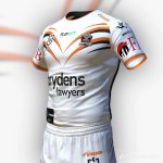
Best uniform in the nfl that all white one...
Oilers throwback & helmet are gr8 2, but I digress

Tucker
Well-known member
Adopting the position that goes with that kit.
Kaito
Well-known member
Adopting the position that goes with that kit.
We're not in the suggestions thread bro haha.
Don't know why you hate it Tucker it's niceee
Sully
Well-known member
Tucker
Well-known member
White is a good colour on women. Goes well with gold jewellery. Also a female accessory.We're not in the suggestions thread bro haha.
Don't know why you hate it Tucker it's niceee
Kaito
Well-known member
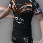
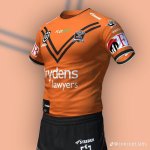
Saw this as a concept that looked good as the Brydens logo blends better
Those home & aways go hard, expertly done 👌🏽
Last edited:
Kaito
Well-known member
White is a good colour on women. Goes well with gold jewellery. Also a female accessory.
Farrr out bro it's almost white linen shirt season
haha. I remember you even hate white sneakers
Lol. I don't know man. Looks good on females too
It's a tired immature argumentNo.
But they don't have a red tongue or yellow eyes like yours either (Pink tongue and varying shades of amber eyes).
They don't have opposable thumbs like the old logo.
Panthers don't have aqua highlights.
Sharks aren't blue.
Vikings (Raiders) didn't have green beards.
Dolphins aren't white with red highlights.
Dragons don't exist.
Are you really upset with the fact that our current logo isn't anatomically accurate?
Tucker
Well-known member
They should be made to wear jet black all next year as punishment for what they did this year.
balmain boy
Well-known member
It's called basic design principles. Keep it simple. Don't introduce complexity of colours or details.Do tigers have orange tongues, and white eyes?
Dogs updated their logo.
Looks atrocious.
All the new A.I friendly logos are shocking.
Manly is the worst though.
Biggest downgrade.
Looks atrocious.
All the new A.I friendly logos are shocking.
Manly is the worst though.
Biggest downgrade.
Tom Shines
Well-known member
Saw the dogs logo on social media … thought it was a troll at first
come back Kaito , its been a long winter - all is forgiven , lol
Hope your happy out there
Fainu Brothers
Well-known member
Bring back the claws!!
Looks like aomething on a kids colouring in placemat from Maccas
GNR4LIFE
Well-known member
Looks like the Paw Patrol.
I think you've done well, it's pretty darn good, but not perfect.Yeah I am, it’s silly
You've put some thought into it and that's good to see.
You've paid homage to the past with the old Western Suburbs logo, and to the new with the pretty fearsome looking tiger.
And you've started something for people to put their mind to over the off-season.
@Halbrowne61, the divisive crap as you so eloquently called it, is only as divisive as you allow it to be.
The left and middle jerseys are by far the best I have seen so far.Saw this as a concept that looked good as the Brydens logo blends better
Members online
- Tiger-ferret
- upthetigers
- weststigerman
- Jimmy Jazz
- Banterboi
- LukeyTuiaki
- Muffstar
- Savvy
- BrissieTiger67
- bythebeardofzeus
- whitecoat
- Illek
- yott21
- claws1
- mtd#2
- Mighty_Tiger
- Viva_Zapata
- AdelaideTiger
- Telltails
- Hefty_Ace
- TCL
- Tiger Tarl
- Nadz4483
- ashman
- NT_Tiger
- Bellend
- Alex Seyfarth's #1 Fan
- stevied
- Speed2burn
- Jimmy
- magpies forever
- Canberratiger
- weststigers
- Tigerstigerstigers
- PrattenParkMagpie
- oldschooltiger
- tigertragic
- Hazard_10
- bptiger 0
- Halbrowne61
- tiger05premier
- TigerGene
- GNR4LIFE
- rex2ce
Total: 3,832 (members: 47, guests: 3,785)