Navigation
Install the app
How to install the app on iOS
Follow along with the video below to see how to install our site as a web app on your home screen.
Note: This feature may not be available in some browsers.
More options
Style variation
You are using an out of date browser. It may not display this or other websites correctly.
You should upgrade or use an alternative browser.
You should upgrade or use an alternative browser.
2010 Jersey Design Vote
- Thread starter Craegus
- Start date
A
alien
Guest
Craegus, would it be possible to see the Proton logo from set 1 into the jerseys in set 2? Why do they need to say 'Proton cars? Proton should make it seem like they are well known and that we should know they are cars. If Holden was a sponsor you wouldnt see 'Holden cars'. You know what I mean :wink:
DrewPeacock
Well-known member
Heres a couple I just did.
Wanted a simple design with nothing too fancy.
Sponsors logo was just for fun!

Wanted a simple design with nothing too fancy.
Sponsors logo was just for fun!


@DREW76 said:Heres a couple I just did.
Wanted a simple design with nothing too fancy.
Sponsors logo was just for fun!

Not bad, they look a bit like a training shirt to me, but still good. You may want to raise the level of the logos though they are a bit low.
\
@alien said:Craegus, would it be possible to see the Proton logo from set 1 into the jerseys in set 2? Why do they need to say 'Proton cars? Proton should make it seem like they are well known and that we should know they are cars. If Holden was a sponsor you wouldnt see 'Holden cars'. You know what I mean :wink:
As per request
[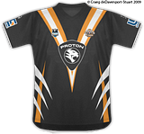](http://s47.photobucket.com/albums/f188/craegus/?action=view¤t=WestsTigersFantasyJTEditBlack3.png)
[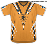](http://s47.photobucket.com/albums/f188/craegus/?action=view¤t=WestsTigersFantasyJTEditOrange1.png)
Good work Drew, but yeah they look like training shirts.
I agree with the K.I.S.S rule. Simple is best, plus it still maintains the tradition of the clubs. I love how simple and recogniseable the AFL jerseys are and they dont change them each year. Craegus, yours are simple yet very effective. Put me down for 10 of the black ones. Those claws on the side scream Tigers so much more than the stupid rectangles we got going now…
If the club rejects that design theyre deadset kidding themselves!
AmericanHistoryX
Well-known member
set 1 for me.
AmericanHistoryX
Well-known member
the black jersies look much better than the gold ones in all 3 categories.
Hit_or_Miss
Member
I voted set 2.
Set 3 arent bad either, they reminded me of a neater version of the 2000 Jerseys.
Set 3 arent bad either, they reminded me of a neater version of the 2000 Jerseys.
Black and white reversed for the bottom section
[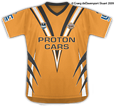](http://s47.photobucket.com/albums/f188/craegus/?action=view¤t=WestsTigersFantasyJTEditOrange2.png)
[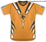](http://s47.photobucket.com/albums/f188/craegus/?action=view¤t=WestsTigersFantasyJTEditOrange3.png)
[](http://s47.photobucket.com/albums/f188/craegus/?action=view¤t=WestsTigersFantasyJTEditOrange2.png)
[](http://s47.photobucket.com/albums/f188/craegus/?action=view¤t=WestsTigersFantasyJTEditOrange3.png)
T
TIGS
Guest
Great work Craegus, they all look good.
Can someone link me to this Football Manager Template site or product so I can have a little fiddle myself?
Can someone link me to this Football Manager Template site or product so I can have a little fiddle myself?
@Rohan said:I just like the simplicity of set 3 or set 1…
They could be made in a cotton blend as well, in the older style!
Bonus.
(Sorry, no edit function available.)
@TIGS said:Can someone link me to this Football Manager Template site or product so I can have a little fiddle myself?
This is the direct link, you will have to register to get to them.
http://www.fmglive.com/forums/index.php?showforum=117
The Template I use for these jerseys is the FMG'09 (the Megatemplate Pack is found in the sub forum of that name). I cut away the shorts and socks from the template when using it for the designs shown on here.