BrissieTiger67
Well-known member
i think there maybe a correlation with an ugly jersey and poor performance this season…. just putting it out there.
Follow along with the video below to see how to install our site as a web app on your home screen.
Note: This feature may not be available in some browsers.
@Craegus said:Just did a slight tweak to the previous designs to add some more white.
@Sabre said:Here a couple of alternative Jerseys designed by me and put together by Craegus.
just for fun.
I rekon they look pretty good though.


@Montague Street said:Eeeeyoooo
They look like Brutus "the barber" Beefcakes recycled wrestling tights
\
\
Posted using RoarFEED
@cktiger said:@Craegus said:Just did a slight tweak to the previous designs to add some more white.

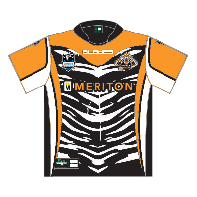
Craegus you are trying too hard with the white now lol.If you put white behind stripes we will look like Zebras.
Your original design was great - maybe with a little extra width of white on the sides and maybe try a white collar .
Ps I ran a design studio for over 20 years and think it's great to see some of you guys putting forward your visions.
@Swordy said:I think something traditional, strong, and a mix of both old clubs such as these…


@Montague Street said:Some or most ladies might love the pink jerseys but not ALL
\
\
Posted using RoarFEED
@Craegus said:@cktiger said:@Craegus said:Just did a slight tweak to the previous designs to add some more white.

Craegus you are trying too hard with the white now lol.If you put white behind stripes we will look like Zebras.
Your original design was great - maybe with a little extra width of white on the sides and maybe try a white collar .
Ps I ran a design studio for over 20 years and think it's great to see some of you guys putting forward your visions.
I know, was just playing around after the comments about the lack of white. Personally I like the current designs and I only did the original 2 after a request for them (though it was a good thought to see if the designs were workable).
