Navigation
Install the app
How to install the app on iOS
Follow along with the video below to see how to install our site as a web app on your home screen.
Note: This feature may not be available in some browsers.
More options
Style variation
You are using an out of date browser. It may not display this or other websites correctly.
You should upgrade or use an alternative browser.
You should upgrade or use an alternative browser.
New Wests Tigers Jersey
- Thread starter Billy M
- Start date
Dr Concord
Member
Dr Concord
Member
How do they fit around the waist coch? 😉😉And that is coming from someone who doesn't have any shoulders.
Haha you won't get them back eitherI offered one to Lee Hagipantelis to cry on, and he took both.
Looks like we been run over by a truckView attachment 16400
This would be cool
Buttface
Well-known member
Tiger Tarl
Well-known member
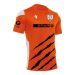
I think we're missing a huge opportunity that is unique to our team and basically untapped...
STRIPES.
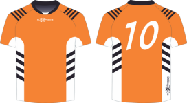
I'm talking actual tiger stripes. Keep them clean, simple, even just on the shoulders like the Bengals in the NFL (see below). Could be incorporated into the more traditional V jersey by outting a few along the side OR we could completely modernise our look.
I guarantee we'd get a heap more young fans on that design element alone. I think we underestimate the 'tiger' brand. One of the most striking animals and beloved by kids. Let's lean into our strengths, leverage what we have staring us in the face. It's a no brainer in my opinion.


Kelce68
Well-known member
Dennisspicer1
Well-known member
Looks bloody terrible.View attachment 16400
This would be cool
watersider
Well-known member
Yes, jersey's should be simple design with slight tweaks to justify new jersey purchase each year but honour the original.
I like the idea of having a fairly stable home jersey and more experimentation and design flair with the away jersey, like what the premier league teams do.
Liverpool for example have a simple red jersey, that's it, but then little changes like a subtle pattern feel or a line here or there feel like major changes. Same with Tottenham and Real Madrid and their white jersey. I'm sure none of them have trouble selling jerseys every year. Then their alternative jerseys are often way out their with fluro colours and weird designs for those people thirsting for that sort of thing.
A stable and classic base design adds value to the jersey and gives the club a clear identity. I like how Souths and the Roosters do that.
Like most things at our club we haven't really built up any key characteristics in our jersey.
TurnStyle
Well-known member
Have always thought this myself. Subtle stripes and orange.I think we're missing a huge opportunity that is unique to our team and basically untapped...
STRIPES.
I'm talking actual tiger stripes. Keep them clean, simple, even just on the shoulders like the Bengals in the NFL (see below). Could be incorporated into the more traditional V jersey by outting a few along the side OR we could completely modernise our look.
I guarantee we'd get a heap more young fans on that design element alone. I think we underestimate the 'tiger' brand. One of the most striking animals and beloved by kids. Let's lean into our strengths, leverage what we have staring us in the face. It's a no brainer in my opinion.
View attachment 16409
Pork chops and apple sauce.
TurnStyle
Well-known member
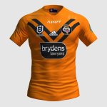
Okay, so these look pretty damn good.... Like the orange and would love to see a white one.To me, the simpler design, the better.
Too many angles, sharp points, stuff like stripes, claws, etc, make it all too messy and not aesthetic in any way, shape or form. That includes the mid and late 2000's strips that were WAY too busy.
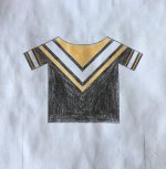
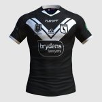
Personally, something like this is more my taste. View attachment 16414View attachment 16415
Kelce68
Well-known member
HowDugWT
Well-known member
That reminds me of the ugly as 2013 away strip.View attachment 16400
This would be cool
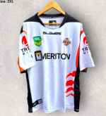
Couldn't stand this jersey. Maybe because it reminds me of Braith Anasta
happy_tiger
Well-known member
The top Jersey looks more like a Kiwi Jersey
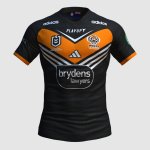
That Black one is gorgeousTo me, the simpler design, the better.
Too many angles, sharp points, stuff like stripes, claws, etc, make it all too messy and not aesthetic in any way, shape or form. That includes the mid and late 2000's strips that were WAY too busy.
Personally, something like this is more my taste. View attachment 16414
Just get that Brydens logo of as soon as possible
Canberratiger
Well-known member
PLEASE give us something even similar to these!To me, the simpler design, the better.
Too many angles, sharp points, stuff like stripes, claws, etc, make it all too messy and not aesthetic in any way, shape or form. That includes the mid and late 2000's strips that were WAY too busy.
Personally, something like this is more my taste. View attachment 16414View attachment 16415
The current jerseys are garbage
Kelce68
Well-known member
I agree mate.PLEASE give us something even similar to these!
The current jerseys are garbage
I don't think we've ever got it quite right. I can't recall a single jersey I've fallen in love with at first sight.
.... Though I still have 13 of them. Haha.
