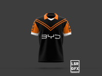
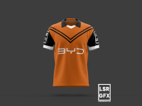
New Wests Tigers Jersey

I'd like something simple and sorry - not a chevron in sight (they can be the heritage rounds)!

Jersey design is like painting walls: you have to consider there's going to be a lot of stuff covering a lot of it, so I think erring on the side of minimalism is the way to go.

They're all permutations of the same design and it gets like spot the difference... 😳

I've also used a charcoal rather than full black....but hey, grey is made from black and white! 🤣

People will either love them or hate them; but I thought that given I've had a bit to say in this thread I should put my own designs out there as @Billy M and others have had the courage to.

View attachment 16657View attachment 16658View attachment 16659View attachment 16660View attachment 16661View attachment 16663View attachment 16664
Minimalist yes, and I do like them but feel they are more suited to a training jersey or maybe a polo or T shirt.

My thoughts only and then it all changes a lot when you add all the sponsorships, which you have already alluded to.
 
I'd like something simple and sorry - not a chevron in sight (they can be the heritage rounds)!

Jersey design is like painting walls: you have to consider there's going to be a lot of stuff covering a lot of it, so I think erring on the side of minimalism is the way to go.

They're all permutations of the same design and it gets like spot the difference... 😳

I've also used a charcoal rather than full black....but hey, grey is made from black and white! 🤣

People will either love them or hate them; but I thought that given I've had a bit to say in this thread I should put my own designs out there as @Billy M and others have had the courage to.

View attachment 16657View attachment 16658View attachment 16659View attachment 16660View attachment 16661View attachment 16663View attachment 16664
Like the 6th one down ......especially if it isn't Steeden
 
Minimalist yes, and I do like them but feel they are more suited to a training jersey or maybe a polo or T shirt.

My thoughts only and then it all changes a lot when you add all the sponsorships, which you have already alluded to.
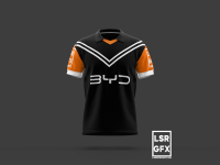
Thanks @hank37w

I really appreciate your way of saying they're not what you'd go with for playing jerseys. 😊
 
The original design wasn't as busy, but it was cheesy as.

It looked ok on a retro last year, but the lightning bolt motif was very dated.

It's akin to a pair of Hot Tuna boardies, with flames on them, that go down past someone's knees.

Hot shit at the time, very dated these days.
Geez next you'll be telling me to stop wearing my Affliction t-shirt! 😳 🤣
 
Just a simple quick alt alt design 🙂View attachment 16807Thanks for the effort! Can't say I like these though, the V sign to too thin and comes across as a bit weak. Need to move on from Balmain or Wests themed jerseys, those clubs are dead.

I too agree the simple Orange and Black designs that Gareth modelled were awesome. The current jerseys are actually quite good, unfortunately the sponsor mars the design.
 
Back
Top